September 05, 20243 min read
What Is Brand Identity? A Deep Dive into the Essential Role of the Brand Book
Blog
June 11, 2025
Ever had a logo that customers couldn’t remember, or one they couldn’t distinguish from other clinics? It might be because the logo is beautiful but fails to communicate the brand’s true identity. Want your clinic to look credible to customers? It starts with the logo!
A logo isn’t just a mark; it’s the "face" of the brand across every channel—from the storefront and social media to even the packaging on a cream box. If you are planning to design a beauty clinic logo, we’re here to walk you through the common mistakes many clinics have faced and provide effective, practical guidelines for clinic logo design that delivers real results. Let’s dive in...
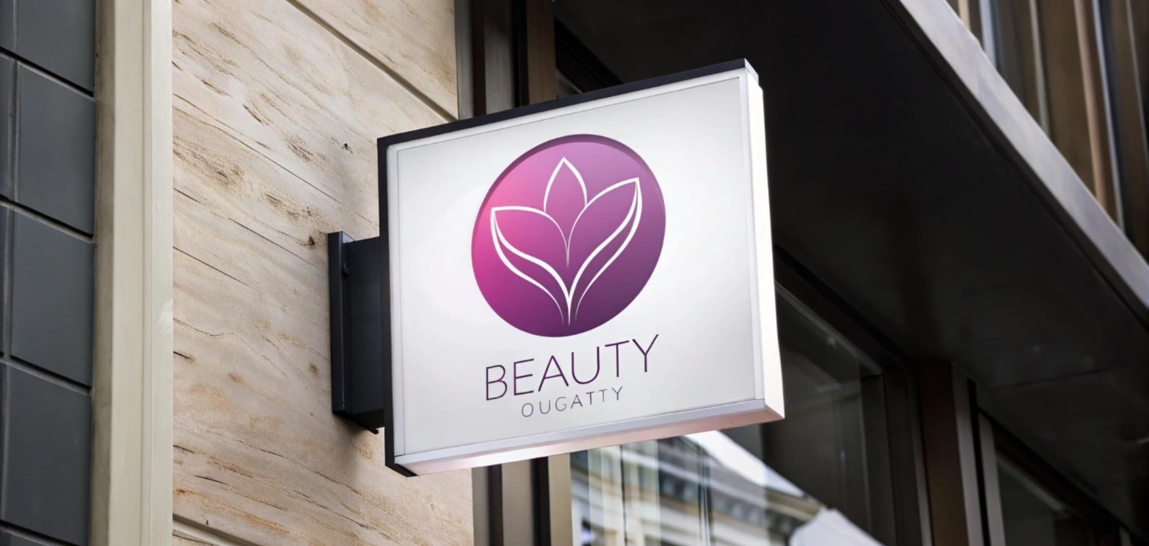
A beautiful logo that doesn’t say what the brand is = A big mistake!
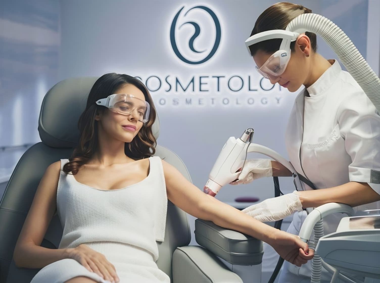
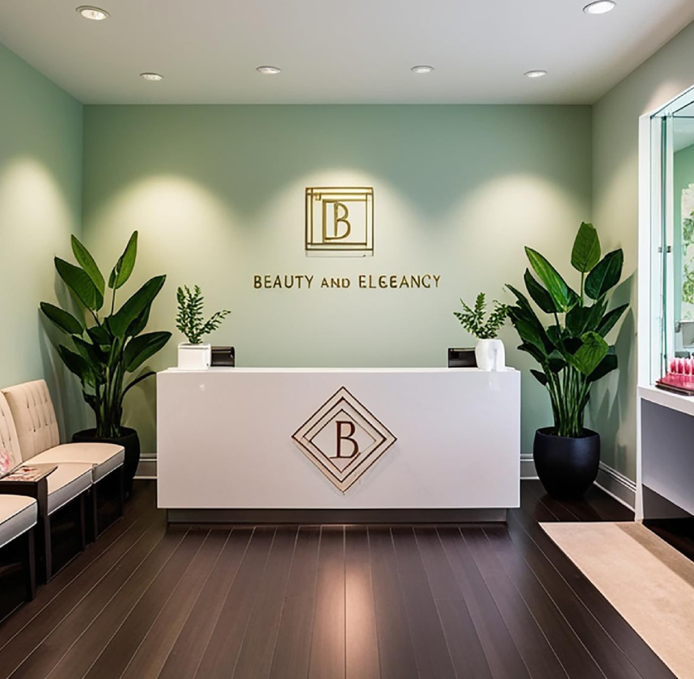
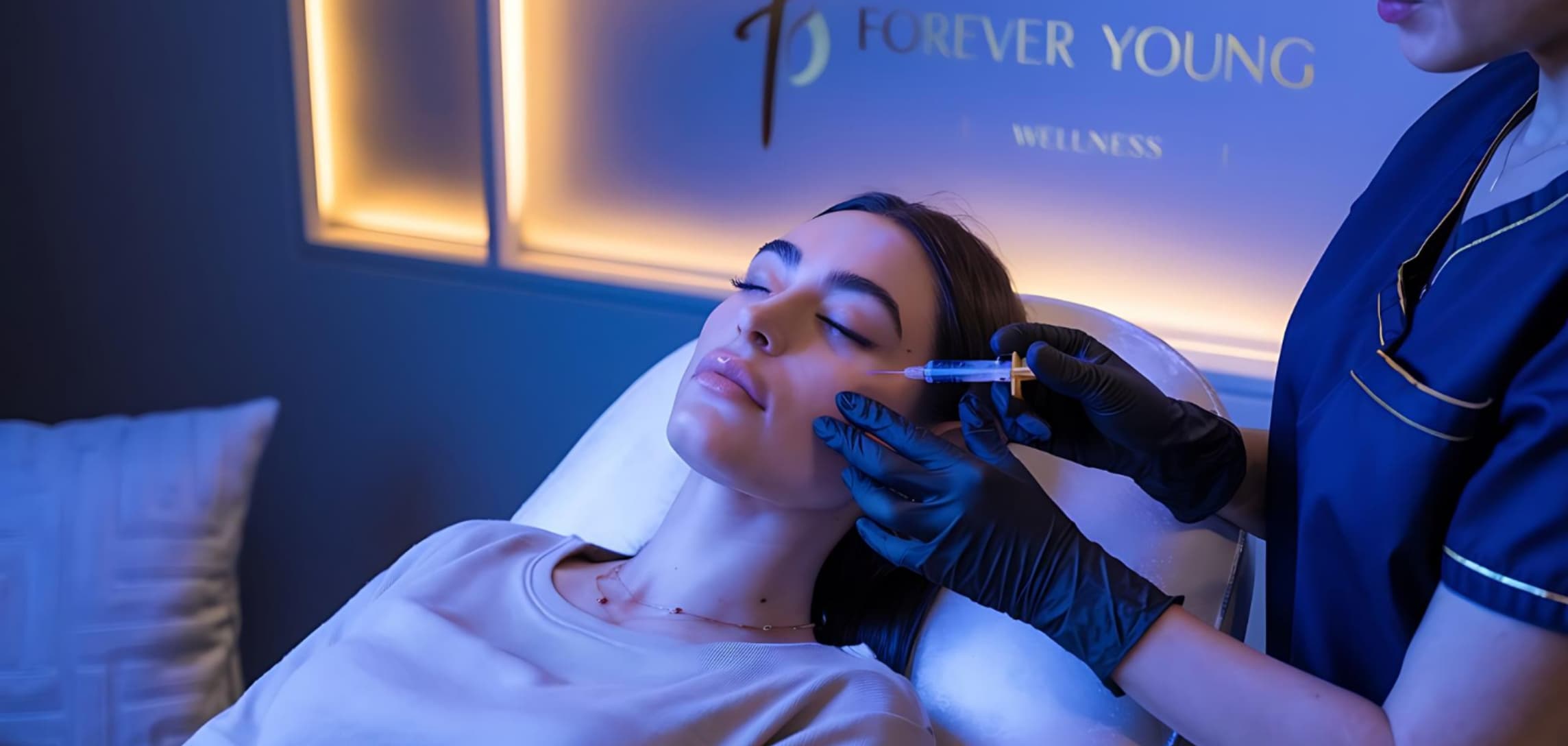
A good clinic logo design must have a "feeling" that aligns with the brand, not just be a pretty picture. Beauty clinics have various styles—be it luxury, natural, modern, or accessible. Therefore, the beauty clinic logo design should reflect the brand’s personality as clearly as possible.
Fonts are small details that have an incredible effect on the "emotion" of a logo. They reflect the clinic’s character without saying a word.
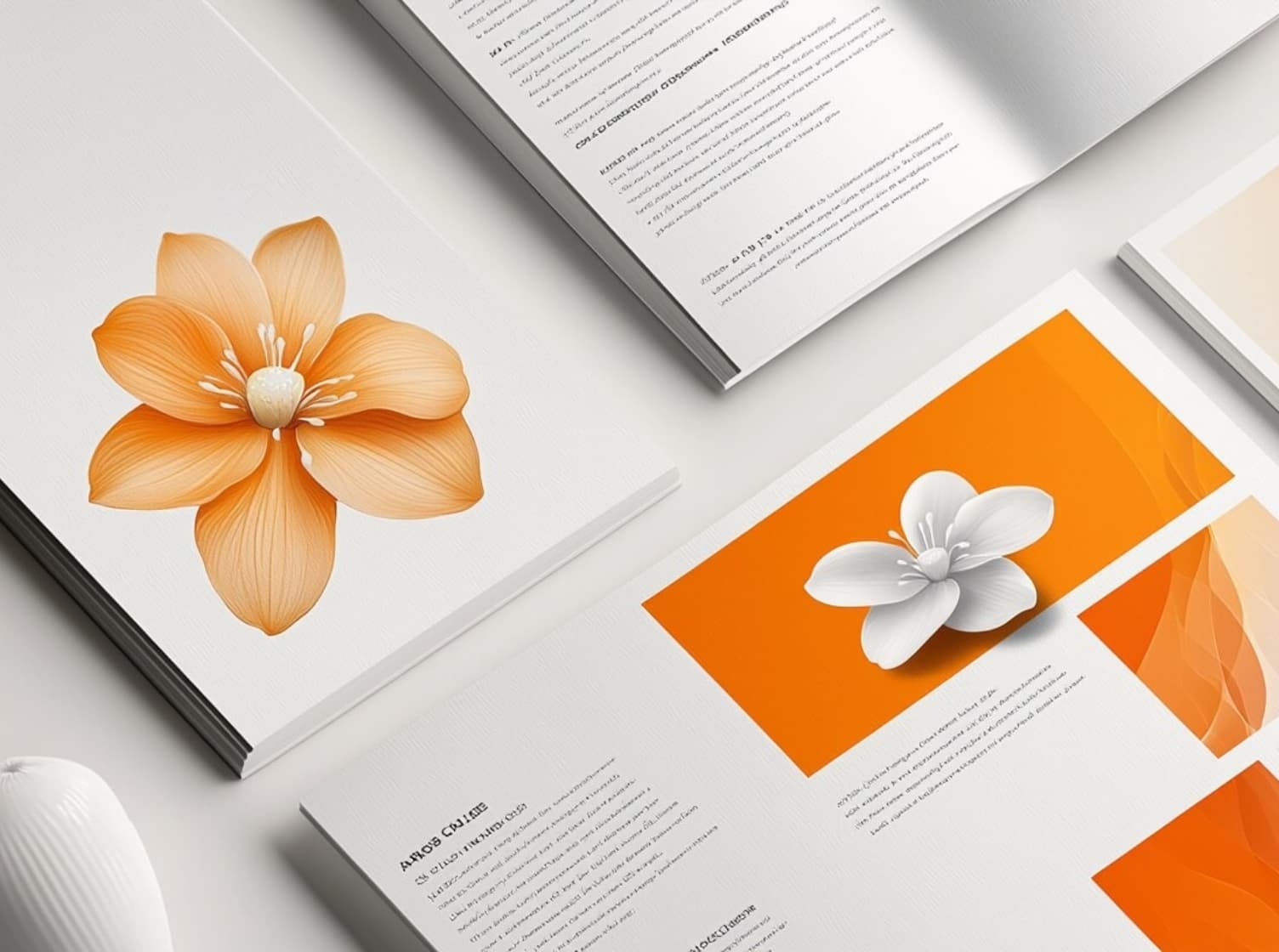
Designing a logo that includes everything—like the full name, a face, flower icons, leaves, a syringe, and a border—often feels cluttered. A good logo should be simple, memorable, easy to use, and flexible. A good logo design must consider its real-world application, such as:
A logo with too much detail cannot be scaled down effectively; it becomes blurry and violates the principles of good logo design.
How to fix this:
Additionally, if using the services of a clinic logo design company, you should request multiple file formats, such as horizontal, simplified (icon-only), and black-and-white versions, to ensure usability in all situations.
Many clinics start with a single service, like fillers, but later expand into lasers, surgery, or franchising. If the initial logo is "too restrictive," it can become an obstacle. A good beauty clinic logo design must not only serve today’s needs but also those of the next 5-10 years.
A logo isn’t just a graphic; it’s the "brand image" that customers use to remember your clinic. Therefore, designing a beauty clinic logo must be done with care, reflecting on the brand’s identity and looking ahead to future growth.
As we’ve seen, the four main mistakes—ambiguous communication, unsuitable fonts, excessive detail, and a lack of future planning—are often overlooked. If you are starting a business or rebranding a beauty clinic, don’t forget to prioritize good clinic logo design from the start. This is "the most worthwhile investment" for a beauty business in an era where image drives decisions.
Blog