In an age where people use a wide variety of devices to access websites, having a site that can adapt to that device’s screen size is crucial. This approach is called "Responsive Design," and it helps your website look good and function easily, whether opened on a computer, tablet, or mobile phone. Understanding what Responsive Design is and why it’s important for a Mobile Site will help you create an effective website that fully meets user needs.
What is Responsive Design?
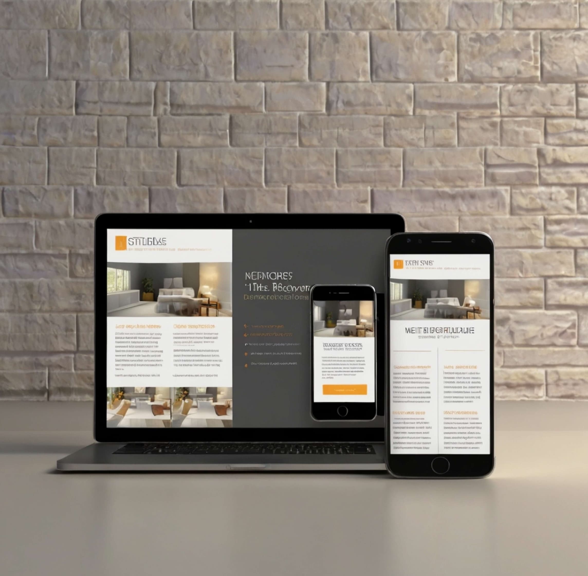
Responsive Design is the practice of designing a website to change its display layout according to the size of the screen the user is on, such as a computer, laptop, mobile phone, or tablet. No matter which device the website is viewed on, a responsively designed site will adjust its size and content arrangement to fit the screen, providing users with a good and comfortable experience.
How Responsive Design Works
Responsive design uses HTML, CSS, and JavaScript techniques to make the website scalable and look good on any device. It uses the following techniques:
- Fluid Grid: A flexible grid design that uses percentages for sizing instead of fixed units. This helps content adapt to the screen size.
- Flexible Images: Adjusting the size of images to fit the screen, ensuring they display beautifully and do not crowd the content.
- CSS Media Queries: Using Media Queries in CSS to define appropriate styles for different screen sizes, making the website look good and easy to use on all devices.
Advantages of Responsive Design for a Mobile Site
- Convenient and Cost-Effective: By using Responsive Design, you only have one website to update. This reduces the hassle of managing multiple URLs and saves budget on development and maintenance.
- Increased Mobile-Friendliness: A design that supports mobile devices increases user satisfaction and makes your website more accessible.
- Better SEO: Responsive Design helps Google and other search engines understand that your website offers a good user experience, which positively affects your search result rankings.
- Improved User Experience: A responsive design allows users to access information and functions easily regardless of the device, making website usage smooth.
The Feel of Using a Mobile Site
- Quick Access to Information: A well-designed Mobile Site allows users to access the information they need quickly and easily, whether it’s searching for products, reading articles, or making online transactions.
- Hassle-Free Usage: A proper design ensures buttons and links are appropriately sized for tapping with fingers on a touchscreen. It also allows for smooth scrolling and navigation.
- Clear Display: Adjusting images and content to fit the screen size helps users see information clearly without needing to zoom in or out, making the site convenient to use.
- Fast Loading Speed: A responsive Mobile Site will have fast loading speeds, which is crucial for retaining users and reducing the bounce rate.
Cautions for Responsive Design
- Test on Various Screen Sizes: You should test the website on different devices and screen sizes to ensure it displays correctly.
- Arrange Content Appropriately: Place important information where it is easily visible and organize the content to suit the screen size.
- Adjust Image and Text Size: Image and text sizes should be adapted to the screen to make reading and viewing convenient.
- Loading Speed: Compress images and reduce data size to increase the website’s loading speed. This improves the user experience and helps your site rank well on Google.
Conclusion
Responsive Design is the practice of designing a website to adapt to the screen sizes of various devices, making your site look good and easy to use regardless of how it’s accessed. Especially in the current era where access via Mobile Site is critical, using Responsive Design ensures your site can meet user needs exceptionally well, increase user satisfaction, encourage repeat visits, and reduce the chances of users leaving prematurely due to a smooth and responsive experience.
Furthermore, Responsive Design is highly beneficial for online marketing, as a responsive website helps increase user reach and engagement, which is essential for building a brand and attracting new customers. Having a responsive Mobile Site helps you reach a larger target audience and efficiently increases opportunities for generating online marketing revenue. If your business needs professionals to manage its website, look for or choose an agency specializing in Responsive Design, like Avery, which has continuous experience managing websites for clients ranging from SMEs to leading companies.