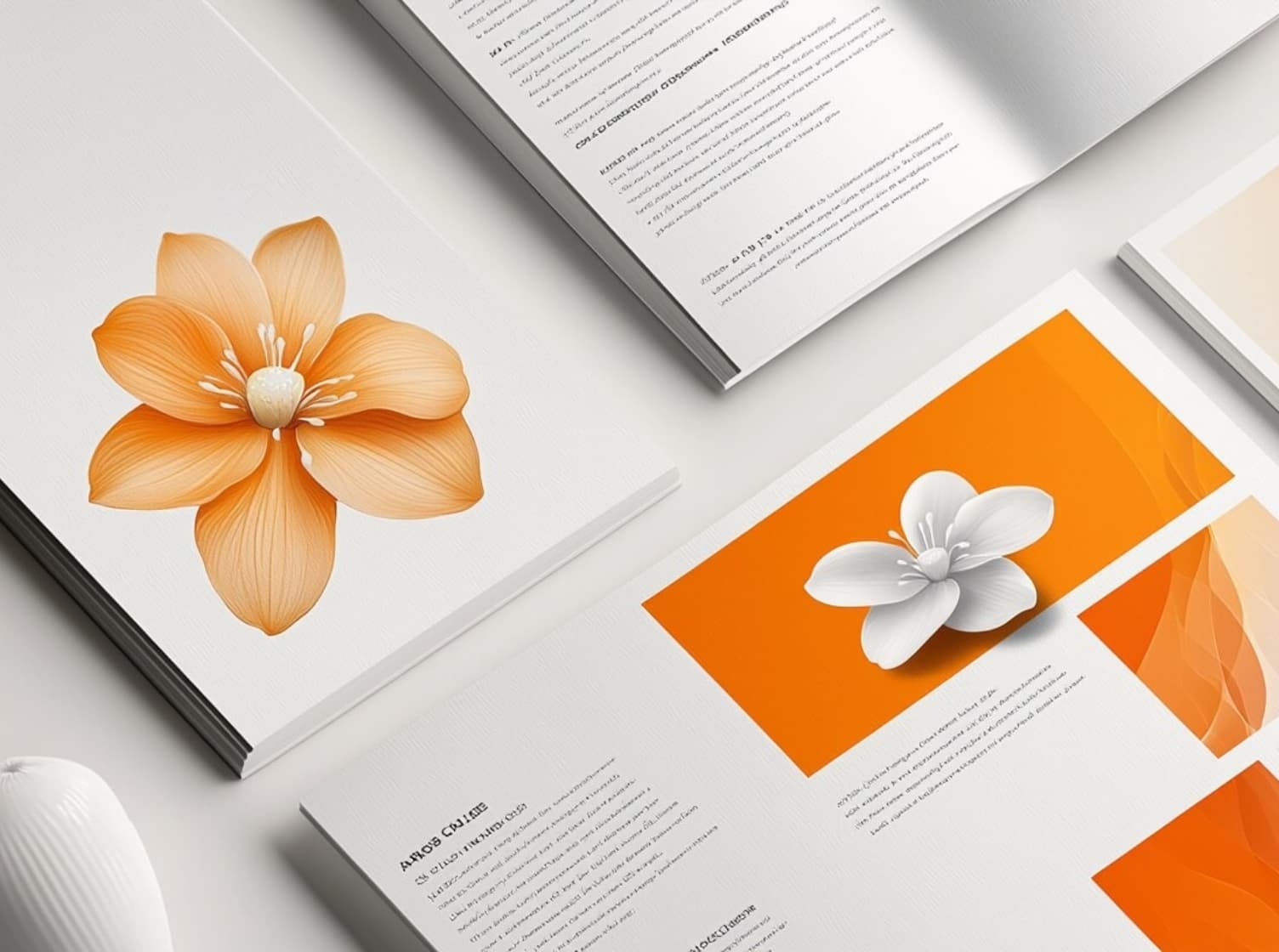
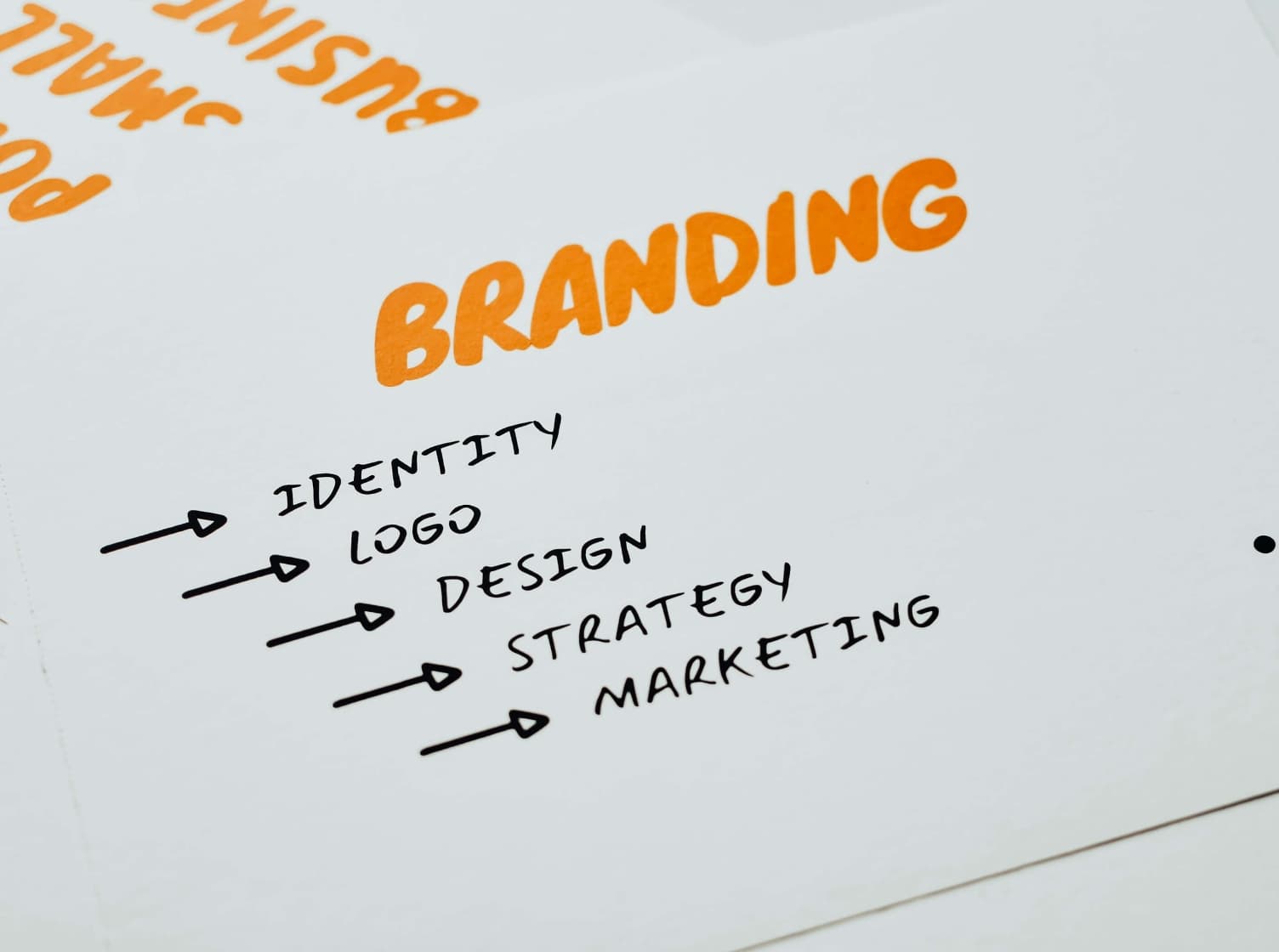
A logo is not just a symbol that builds brand awareness; it is a crucial element that clearly reflects the business’s identity and values. An effective and outstanding logo design can create a strong impression and enhance a brand’s credibility. For anyone looking to design a logo, let’s look at these great techniques from a professional agency team.
1. Understand the Brand and Target Audience
Effective logo design begins with understanding your brand and the target audience you want to communicate with.
- Analyze the brand’s values and identity:
Consider what your brand’s values are and what unique points you want to present, such as professionalism, fun, luxury, or friendliness. A good logo should clearly reflect these values and identity.
- Identify the target audience:
Understand your target audience, including their age, gender, geographic location, or interests, to design a logo that can effectively attract and communicate with them.
2. Use Colors and Fonts that Reflect the Brand’s Personality
The colors and fonts used in a logo significantly affect the feelings and perceptions customers have of the brand.
- Choose colors that convey the desired emotion:
Different colors have different meanings. Red might convey energy and enthusiasm, blue might suggest calmness and reliability, while green can represent nature and health. Choosing the right colors will help build an image consistent with the brand.
- Choose fonts that reflect the brand’s image in the logo design:
Fonts are just as important as colors. A serif font might suit a brand wanting to convey formality and class, while a sans-serif font may be better for a brand aiming for a modern and simple feel.
3. Design for Simplicity and Memorability
A good logo should be easy to remember and not overly complex, while still having a distinct identity.
- Emphasize simplicity:
A simple logo looks good at various sizes and is easy to remember, like the Apple logo (just a bitten apple) or the Nike logo (a distinctive swoosh).
- Create a unique identity:
Design a logo that is different and not easily confused with competitors by using unique shapes, symbols, or graphic elements.
4. Ensure Versatility in Usage
The logo should be flexible enough to be used across various media and formats.
- Design for use in both color and black & white:
A good logo should look good and communicate clearly whether in full color or in black and white.
- Prepare the logo in multiple formats:
You should have several logo variations, such as a symbol-only version or one that includes the brand name, for flexibility across different media.
5. Test and Gather Feedback
Testing a new logo with the target audience can help determine if it communicates the intended message.
- Test with a sample group:
Have a sample of your target audience view and provide feedback on the logo to see if it communicates as desired.
- Improve based on feedback:
Listen to the opinions and suggestions from those who tested the logo and make improvements based on their recommendations.
6. Aim for Timelessness
A good logo design should not follow trends that may quickly become outdated. It should be designed for longevity without needing frequent updates.
- Avoid being overly trendy:
Design a logo that is classic and can withstand changing fads.
- Consider long-term usability:
Design a logo that can be used for the long haul and still look good no matter how much time has passed.
Logo Design Guidelines for Business Groups
- Hotel Logo Design
A hotel logo doesn’t just communicate luxury; it must convey a sense of welcome, comfort, and the location’s identity. Using formal fonts, calm and warm color tones (like blue, gray, gold, or white), and symbols related to service or the hotel’s geography is what makes a hotel logo stand out and memorable.
Example:The "Mountview Resort" logo uses a mountain symbol and a simple but elegant font to represent tranquility and nature.
- Restaurant Logo Design
Restaurants need logos that convey taste, experience, and the specialty of their food or service. Using bright color tones (like red, yellow, or green) and symbols related to food or that food’s culture helps create an emotional connection with customers.
Example:The "Spicy Thai Bistro" logo uses a spoon and fork symbol, a modern Thai font, and the colors red and gold to express the richness of Thai food.
- Clinic Logo Design
Clinic logos often focus on feelings of safety and reliability. Using neutral and calm colors (like blue, white, or light green) along with formal and simple fonts helps patients feel confident and relaxed. The logo should convey health, care, and modernity.
Example:The "GreenCare Medical" clinic logo uses an image of hands holding a heart to show care, with the color green to signify good health.
- Product Logo Design
Product logos vary greatly depending on the product type, but the key is that the logo must be memorable and reflect the product’s value. Choosing colors and fonts that resonate with the target audience is essential. Bright colors and a simple, clear design will help the product stand out in the market.
Example:The "EcoFresh" product logo uses a leaf symbol and light green color to communicate that the product is environmentally friendly and fresh.
Conclusion
Designing a logo that wins customers’ hearts involves creating a clear brand identity, choosing colors and fonts that reflect professionalism, designing for simplicity and versatility, and testing and improving based on feedback.
Furthermore, using the services of a professional agency that offers branding design will help the brand get a logo that is not only beautiful but also creates a powerful first impression and effectively builds brand recognition. No matter the business, a high-quality logo design is a key factor in attracting and retaining customers in a highly competitive market.