
May 27, 20253 min read
2025 Corporate Website Tips: Secrets to Creating a Website That Best Meets Customer Needs
Blog

September 13, 2024
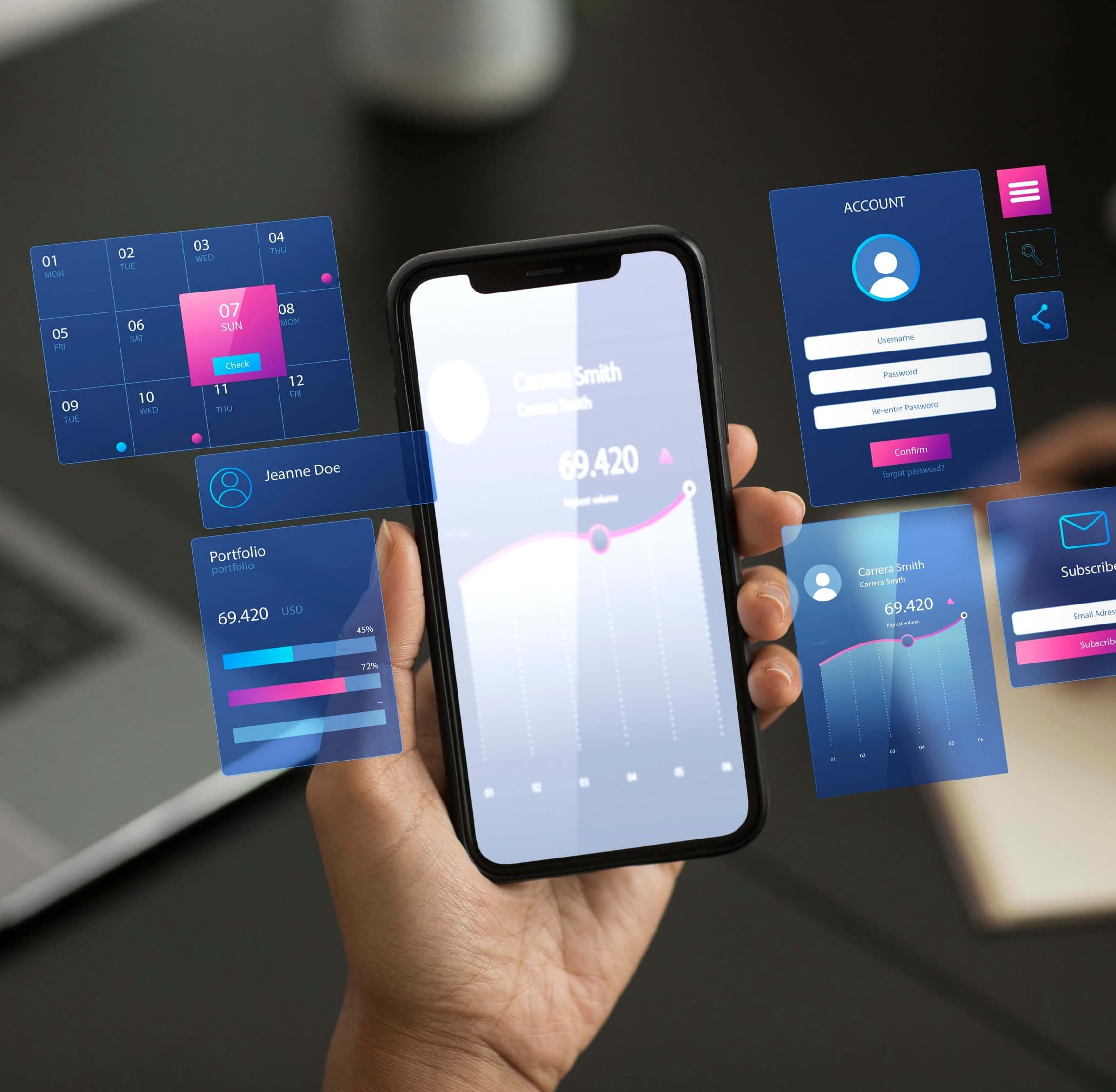
In an era where smartphones and tablets have become the primary tools for accessing information and services, having a mobile-friendly website (Mobile Site) is something businesses cannot overlook. A good Mobile Site design not only helps customers access your business—whether it’s a Product, Hotel, Clinic, or various other businesses—more conveniently but also enhances performance and creates a positive user experience. Choosing an Agency with expertise in Mobile Site design is a crucial first step in building a website that is responsive and effective in this digital age.
Responsive design is a fundamental technique necessary for a Mobile Site. Using Responsive Design techniques allows your business’s website to adjust its size and layout according to different screen sizes. Choosing an Agency with expertise in Responsive Design will help your website look good and function well on smartphones, tablets, and desktops alike. For example, using flexible layouts and appropriate element placement for the device’s screen size.
Website loading speed affects user experience and search engine rankings. A Mobile Site design with high loading speed ensures users don’t have to wait long and can access your business information more quickly. Optimizing website loading will help you reduce load times and increase site efficiency, such as by reducing the size of unnecessary images and files and using data compression techniques.
Convenient and easy-to-use navigation is crucial in Mobile Site design. A design with clear menus and buttons large enough for finger taps helps users find your business’s information and services quickly. An expert Agency will help design a mobile UX/UI that ensures your website has a simple and efficient navigation system, such as using dropdown menus and appropriately sized buttons for touchscreen use.
Designing content suitable for mobile is important for creating a good user experience. Using easy-to-read fonts, appropriate text sizes, and an uncluttered content layout helps users read and understand the material more easily. Choosing an Agency that can design content and graphics suitable for mobile screen sizes will make your website more engaging and user-friendly.
A design that supports touch functionality is essential for a Mobile Site. Making buttons and links large enough for finger taps and adding ample spacing around buttons ensures smooth mobile operation. Choosing an Agency with expertise in designing websites suitable for touch interaction will increase ease of use and reduce click errors.

A good Mobile Site design is essential for businesses in the digital age. Using techniques like Responsive Design, increasing loading speed, simplifying navigation, creating mobile-friendly content, and supporting touch functionality will help your website meet user needs and create a positive experience. Choosing an expert Agency like Avery & Co. for your Mobile Site design will help your business adapt well in the digital world and achieve success in the online market.
Blog
2025 Corporate Website Tips: Secrets to Creating a Website That Best Meets Customer Needs

What is Responsive Design? Making Websites for Mobile

Exploring the Latest Website Design Trends from Avery and Co: Brand Consultant Bangkok